My work in Numbers
I delivered 300+ Wireframes for both desktop and mobile, with distinct adaptive product design to respond to identified design challenges.

THE PRODUCT
What is Protean ENPS ?
Protean eNPS is a platform for subscribing to India’s National Pension System (NPS). This project focused on the enterprise version, used by banks to onboard users in-branch or through integrated digital journeys.
Protean supports both self-serve and bank-led flows, making it a core B2B2C infrastructure tool.
ENPS
White- labelled Fintech Forms redesigned for increased accessibility and faster registration of customers. For both Desktop and Mobile.


OVERVIEW
June - Oct 2022
Designed the onboarding experience for India’s National Pension System (NPS) via Protean eNPS enterprise software, with the goal of creating white-labeled, WCAG A level compliant forms accessible and a scalable design system that banks could adopt across with their own branding across the product.
As the sole UX designer, I owned the end-to-end UX process, from research to delivery -collaborating with PMs and stakeholders to address user needs. Delivered 300+ desktop and mobile wireframes, and co-created a scalable white-label design system.
Parts of this project are under NDA.
TEAM
1 UX Designer, 1 Product Manager, 2 UI Designers, Engineers.
Design Challenge 1
Reducing The Length of Forms
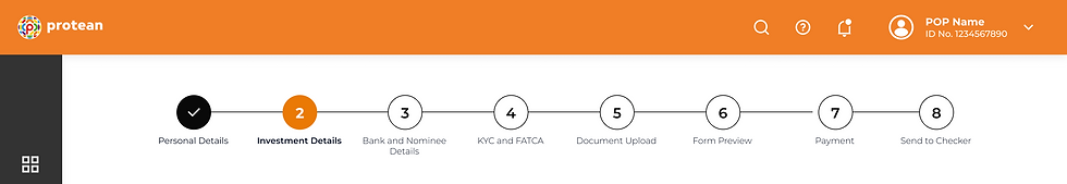
Grouping fields and designing a Wizard to pre inform and reduce ambiguity in form filling.
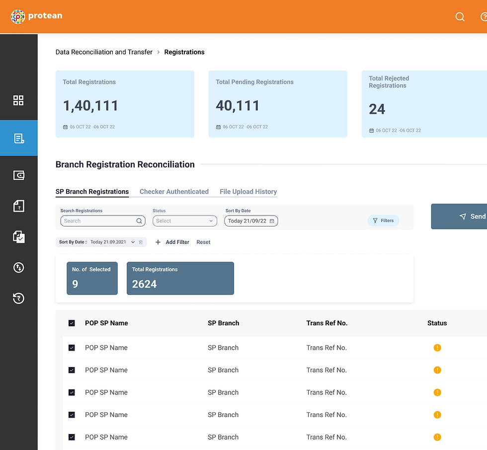
Restructuring data/IA in the form to reduce the no of steps, Introducing a dynamic wizard to keep track of progress and see upcoming steps
Restructured Information Architecture

Wizard Design
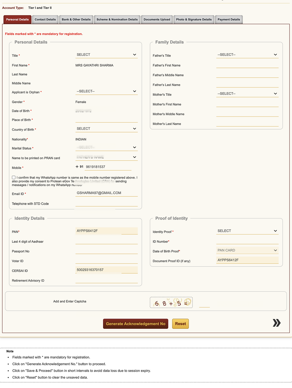
Designing for grouping relevant data for reduced form real estate
1. Moving and hiding optional fields under collapsibles to reduce time and cognitive load required to fill details.
OLD FORM
-
25 fields to fill - per step
-
No distinction between optional and mandatory fields
REDESIGN
-
12 Fields to fill
-
All optional fields grouped under collapsible accordians

2. Designing Information cards for better visual processing of information

3. Conditional information only shown when relevant


THE PROBLEM
Existing forms for registration are lengthy, complex and error prone.
Current modes of registration include an online form and physical forms that can be lengthy, confusing and often result in errors in data filled.
Users - Bank employees aren't always financially or technologically literate to understand parts of the form causing delays in conversion of registered customers.
1 in 5 forms (20%)
were rejected or returned due to errors like missing fields, unclear labels, or incorrect documentation.
~ 30 hrs /month
lost per branch on clarifications, corrections, and manual re-entry
~ 1 in 4 applications
were left incomplete because employees lacked clear guidance to help customers.
Stakeholder research showed -
Research through Stakeholder workshops, interviews, persona analysis revealed key pain points to be addressed in the redesign.
Bank employees found -
Difficult to follow through-
Financial jargon is incomprehensible and a lack of support results in delayed action
Excessively long
Employees don't realise which information is mandatory and which is optional resulting in duplication and long filling times.
Lacking in Support
Employees dont always have the right knowledge on financial services to assist customers in decision making
High Learning Curve
Required hours of technical and customer training sessions.
So,
How might we enable bank employees to onboard NPS subscribers quickly and confidently by simplifying form fields, guiding decision-making, and reducing manual effort ?
Shaping design goals based on stakeholder pain points.
Design Challenge 3
Reduce Form Length and Complexity - Reduce abandonment
Design Challenge 3
Reduce errors, reduce
frustration.
Design Challenge 3
Feel assisted throughout form-filling to make the best informed choice.
THE IMPACT
Since implementation (July 2023)
45%
reduction in time taken to onboard an individual with fulfilling documentation from the time of registration.
6
ENPS distributed to 6 nationalised + private banks in India
~ 1M
People estimated to be onboarded with new forms
Visual Design
A White- labelled scalable, adaptive design system.
A sneak peak into the modular design system created as reusable components that could be easily rebranded by different banks, ensuring visual flexibility while maintaining a consistent user experience.


Rebranded forms proposed for individual banks

THE SOLUTION
Redesigned forms by
✅ Modifying Information architecture and Improving Navigation
✅ Improving Accessibility and Readability
✅ Providing information through, redesigned Product Cards
Design Challenge 2
Designing to reduce errors and frustration in form filling
Improving backend validation and guiding users to fill the right information.
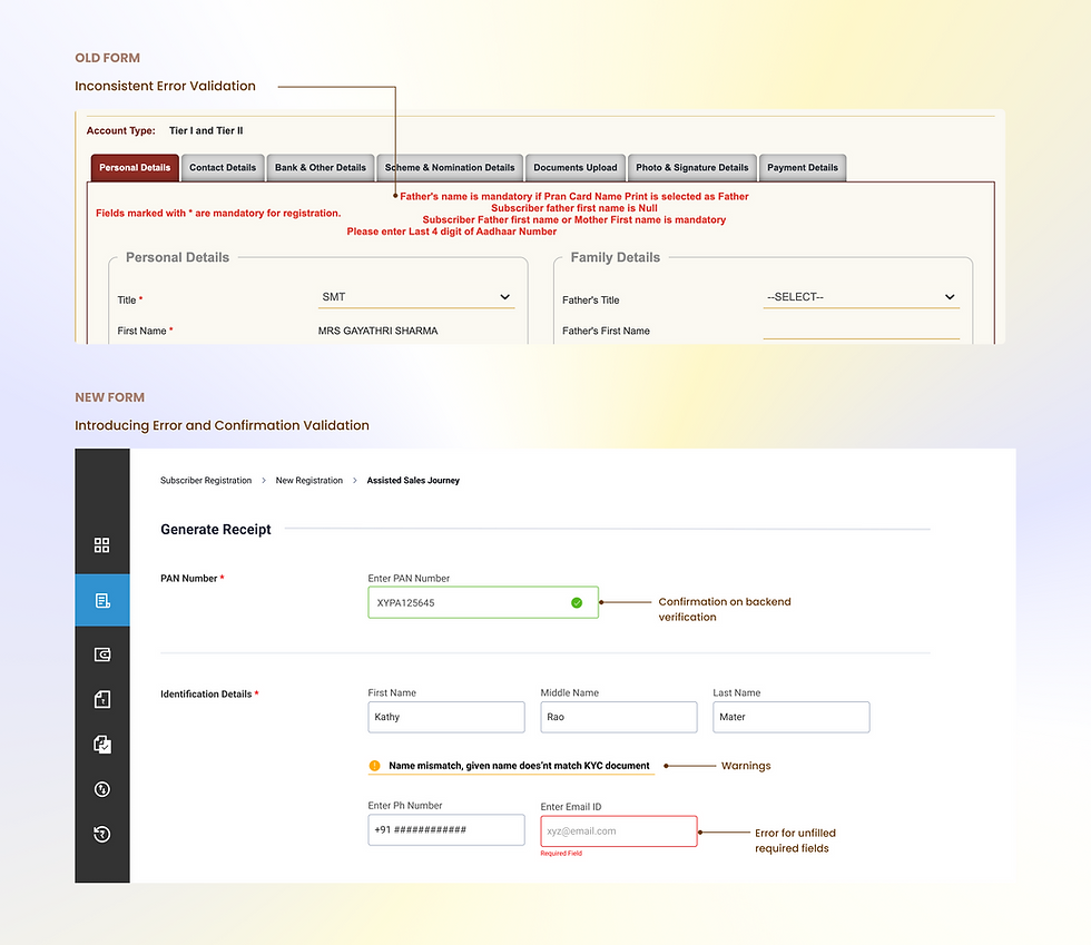
Avoiding double filling by introducing radio options and hiding fields under dynamic collapsibles

Adaptive Design
Adapting the form for mobile usage - Wireframes
Simplifying interactions for smaller screens while preserving clarity and ease of use.

Design Challenge 3
Providing support for ambiguous information throughout formfilling
Helping both individuals and bank employees access information for making informed investment choices.
